This, good people, is my projects page. Here, you may feel free to observe, appreciate, or even criticize the various projects I've worked on in our web design class. Hopefully you find some of them to your liking, but if not, no one is forcing you to come here.
Here we have my Layers project, in which we had to use Photoshop to remove the color from an image and then create at least six layers that would add color to the image. I chose to add color to Rocky's headband, hand wraps, tank top, necklace, and eyes. It was a fairly easy process, and adjusting the opacity on the layers was an easy way to make it look a lot more realistic.
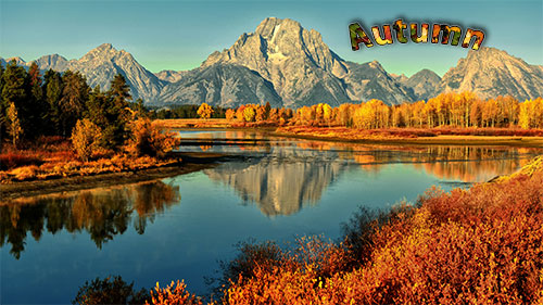
This is my Hue and Saturation project, which, in my opinion, turned out quite well. Once again we used Photoshop to pull all the color from an image of our choosing. Then we used the hue and saturation image editing options to change the color of the image. After settling on four different colors, we moved each seperate image into the same document, where we could choose to arrange them however we pleased. I decided to arrange the images horizontally and give them a white border, but now that I think about it, black may have been a better choice.

To the left you will find my Masking project. For this one, we needed to choose a word that would reflect an image. We then used Photoshop to insert the text, adding a stroke and even a drop shadow to make it more visible. After that, we found another image that reflected the same word, but would also contrast with the background and used masking options to make the image appear inside of the text. I like to think I did a pretty good job on this one.
To the right is my Picture Clean Up project. In this one I took an image that was originally gloomy and bleak and used Photoshop to add a blue sky, a rainbow, some cows, and a barn. I really liked the way i was able to get the clouds to wrap around the mountain, but I also feel like I could have made the rainbow look a little more believable. Maybe if I had the clouds wrap around the ends a bit more...
And here we have my Turkey Trot Logo. To make this one I first found a non-copyrighted image of a turkey that I could trace over using Adobe Fireworks. Once I finished editing the turkey, I moved it into a Photoshop document, where I added the background, text, and the box the turkey has its wing around. I got my inspiration for the design from a past Turkey Trot logo, but added my own twist with a different font, color scheme, and cutting the turkey's wings into seperate layers so that they would appear in front of the box. In my opinion, it turned out pretty well.

