 |
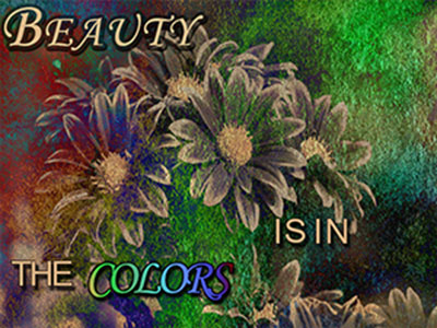
This picture is probably my favorite out of all the ones I have made. I took a simple picture of flowers, made it black and white, layered on a water color picture and put a mask over it to get the vintage look. the word colors took me around 20 minutes to get the colors blended just how I wanted them. |
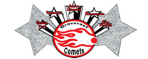
| This is my Graveraet banner. I put together every part of it. I made the Graveraet comets logo, found the small stars online, drew in the stars with the shape tool, and did the words. For the small stars, I had to go snd redraw over all of it to get a cleaner look. The big stars started out white, and I used the stamp tool to fill it in with silver glitter. That took a very long time. Overall I am very proud of what I created and was happy with how it turned out. |
 |
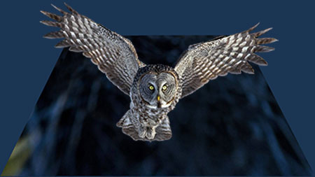 |
I love owls, so of course I’m going to make at least one picture involving them. This is my pop-out picture, and it was relatively easy to make. I started off with two different pictures: The background and the owl. I cut the owl out using the magnetic lasso tool (which is a pain in the butt to use) and I transferred it to my background. Then I pulled the corners of the background in to create the pop-out effect. |
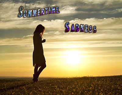
Ah, summertime sadness. We were practicing text and different things we could do with it when I made this. I found the background pic from google and put the text onto it, carefully choosing the font. I then proceeded to find the patter you can see the letters are filled in with from google. Using the Alt key I was able to take that picture and infuse it with the words. Cool, right? I also used the warp tool to bend the words how I liked them. |
 |
| |
|
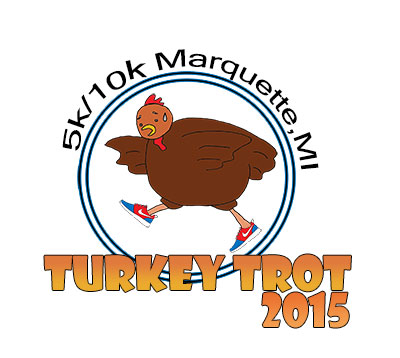 |
Say hello to my Turkey Trot logo. We all had to design our own logo for the 2015 running event. I got my inspiration from past logos. I had to re-draw the turkey using a drawing pad, I put in the circles, words, and color. It took me a few days to figure out how I wanted to color it, especially the TURKEY TROT 2015 part. I ended up using a gradient on the words so I could blend the colors of the turkey into the words. |
This one is an old one. We did this more towards the beginning of the year, and it was not hard. First I had to make the image black and white, then I had to go into image adjustments and change the hue, saturation, and lightness to it. I did this four times (as you can see) and then cropped the image to take out a lot of extra white that was there. We printed them, and it didn’t look all that bad. |
 |

