 |
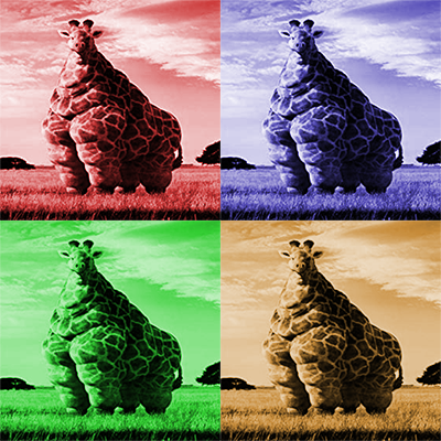
The hue and saturation project taught us how to basically tint an image. I chose a funny picture of an enormous giraffe that I found online. To make this, we added a hue and saturation layer on top of the image four different times and then cropped all four images together. |
 |
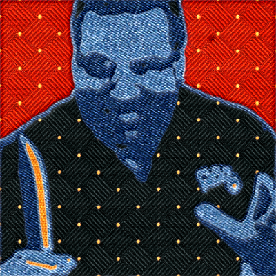
For the patchwork assignment, I chose to use Phil Swift in one of his original commercials. The project turned out pretty cool and is kind of funny. To make it, we separated parts of the image based on color. Then we added a pattern overlay on top of the different color sections. |
 |
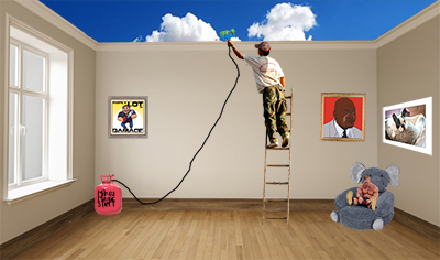
The pic clean up project taught us how to move around, crop, and change the perspective of images to make the room look like somebody's bedroom. I liked this project because of how random the room I made looked. |
 |
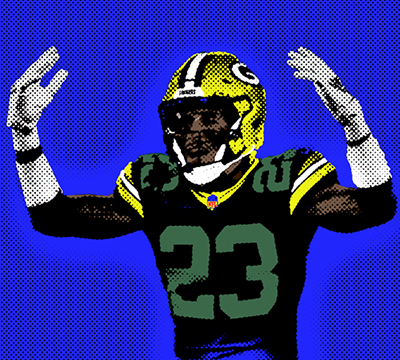
The popart project was fun because of how cool the end product turned out. To make this, we took a picture and got rid of all the colors. Then we added dots in the background and colored back over the image so it wouldn't be black and white. |
 |
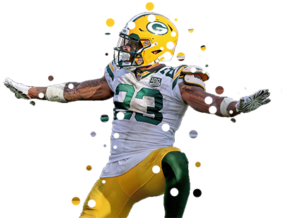
The splatter project taught us how to stretch out an image and then erase holes in the original picture to make it look like the image is falling apart. To make this, we got two copies of an image and stretched out one of them. Then we erased holes in the other layer. |
 |
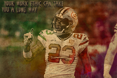
The watercolor assignment was enjoyable because it was simple, yet the end product looked so cool. We started by getting a picture we liked, then put a gradient over it, and finally, got an image of crumpled paper and put the image and gradient on top of it. |


