 |
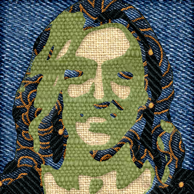
We learned how to use different filters and brushes to make a person that looked like fabric patchwork. I chose one of my favorite US olympic volleyball players. |
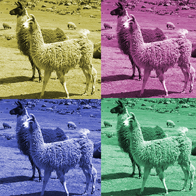 |
For this project we used different hues and saturations to make our image that we chose a cool array of colored images for. |
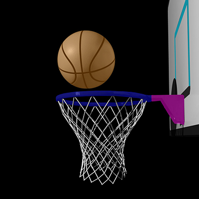 |
In this project we used a series of different layers to make different parts of the image we chose to stand out. I chose a basketball as my image because I like the sport. |
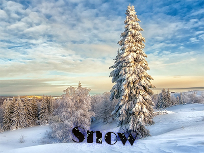 |
For this project I used different brushes on the text to make it look like it was snow. I chose the backround image and the surrouding purple color on the "Snow" text. |
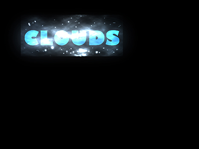 |
In this project we continued to use different brushes over the text to make the backround and the inside of the text look cool. I decided to do a blue gradient color on my text to make it pop. |
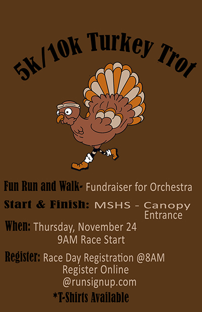 |
In this project we based our turkey poster off of a similar poster we found on the web. We designed our turkey using four different colors, and used a bunch of different fonts to do so. |


